Things I Did
Product Design
UX Strategy
Design System
Interaction & Motion Design
Prototype Development
Company
LiquidAcre
Role
Product Designer
Year
2026
Platform
Desktop web app
LiquidAcre lets everyday investors buy $50 shares of a house, a cabin or a warehouse, earn their part of the rent every month, and sell when they’re ready.
I designed the product end-to-end for first-time property investors, with one job: make a fraction of a building feel tangible, and every number on screen trustworthy.
Where trust gets lost
An investing app is only as convincing as its least believable number.
Before drawing any screens, I listed the moments where a first-time investor would hesitate, and turned each one into a rule the design had to keep.
01
Ownership you can see
100 shares of a 25,000-share villa is 0.4% of it. That’s hard to picture, so ownership is drawn as lots on a plat.
02
Returns that sound like real estate
A triple-digit return reads as a warning, not a pitch. Projected returns stay in the range a rental property can plausibly earn.
03
No surprises where money moves
Fees, totals and your balance appear before you commit, never after a payment fails.
The Product
Twelve screens, six payment dialogs and the sell flow. Each main screen is built around the one question people bring to it.
The dashboard on arrival, once per session
Dashboard
The dashboard answers three questions in the order people ask them. What is my money worth? What is it earning? What should I do next?
The number people come for
Portfolio value leads, with a 12-month chart beneath it drawn to scale.
Income in its own colour
Rent is Harvest everywhere it appears: the monthly figure, the income chart and every payout.
Setup that asks for one thing
A compact card names only the next step, so finishing setup never competes with your portfolio.
Marketplace
Browsing should feel like looking at properties, not at buttons. Each card leads with the photo, the name and the returns, and the whole card is clickable.
Filters that say what they do
Search, type, price and status filters, a sort, and a result count that updates as you filter.
Returns you can believe
Projected 1-year returns of 8.9% to 14.1% and rental yields of 6.0% to 9.2%, all from the same dataset as the dashboard.
One quiet action
Instead of a bright Invest button on every card, a quiet “View property” lets the photos and numbers do the selling.
Each card’s strip fills in reading order, like a row of plots selling out
Land you can subdivide
An acre is land you can split into lots, and that idea gave the product its signature: a parcel grid. Each property is drawn as a simple plat. Funded lots are filled, available lots are outlined, and yours are Mint.
A figure like 0.4% is hard to picture. A lot on a plat is something you can point at. Try it on the villa below.
72% funded
Verbena Coastal Villa: 18,000 of 25,000 shares sold, $50 a share.
100 shares for $5,000 is 0.4% of the property, shown as 1 lot. One lot is 250 shares.
- Funded
- This order
- Available
Marketplace cards
A one-row strip shows how funded each property is.
Your properties
Owned cards show your share of the building in Mint.
Checkout and selling
Lots fill as you change the quantity, and release when you sell.
Listing
The listing is where people decide, so the page is built around that decision. The photo and three key figures lead, and the invest card stays in view as you scroll, carrying the full parcel grid.
The parcel fills lot by lot to 72%, and your order’s lot appears last
Buying, from listing to first payout
Buying is where money moves, so nothing should come as a surprise. The checkout shows the whole order before you commit: shares times price, the fee and the total.
Your balance sits on the payment option. If it’s too low, you see “Not enough for this order” with Add funds right beside it, before you choose it rather than after a payment fails.
Buying 100 shares of Verbena Coastal Villa for $5,075, from the listing to the confirmation
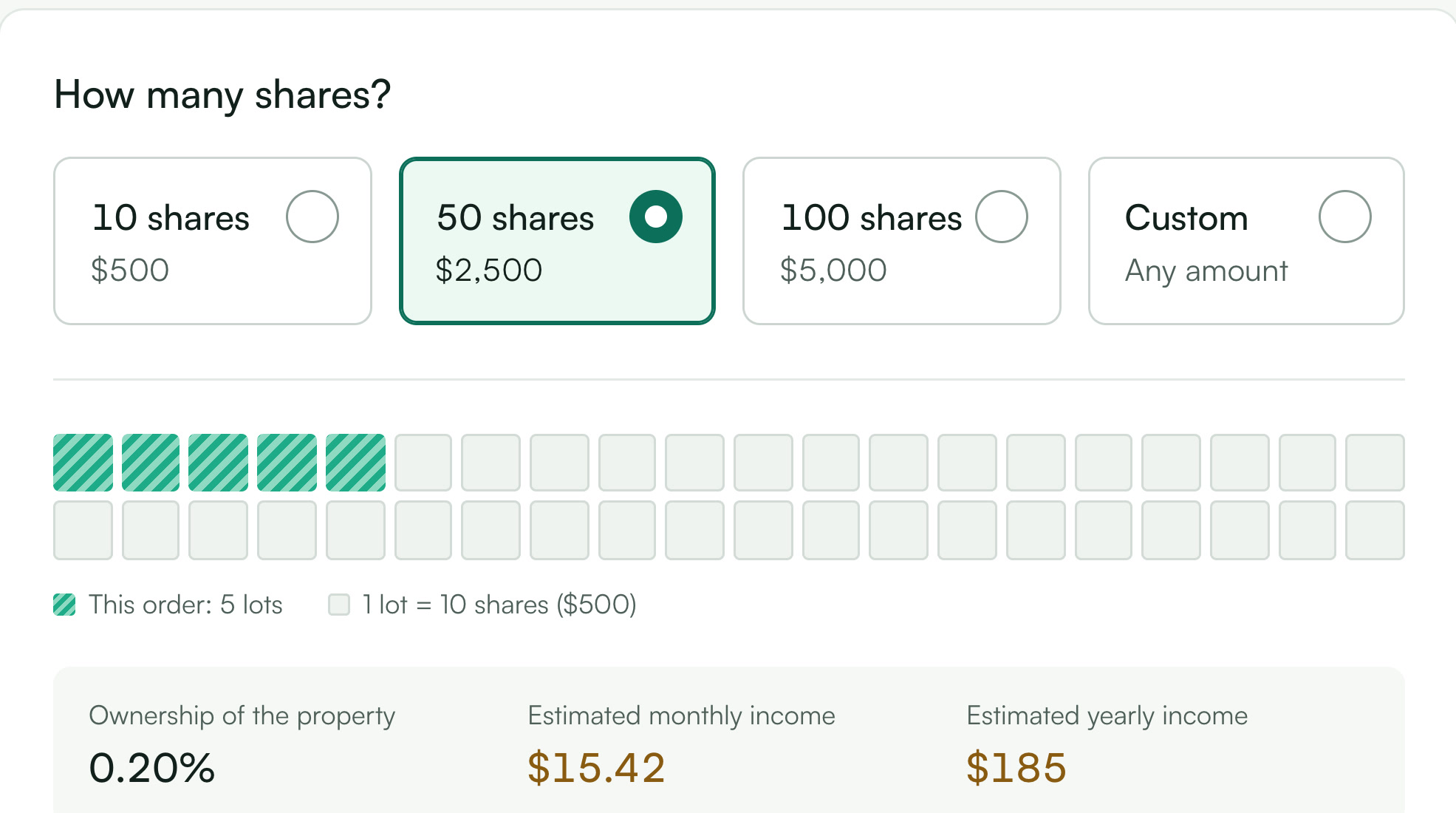
Lots fill as you pick a quantity
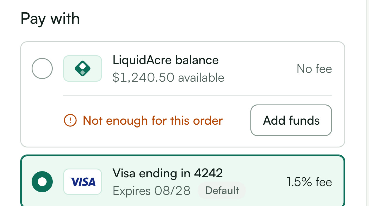
A short balance is flagged on the option itself
A system taken from the land
My first instinct was near-black with a bright mint accent, the default look of every fintech app. I chose Forest and Evergreen instead, colours that come from the land itself, and gave income its own colour so rent has a visual story.
Mint stays a graphic colour only, because it can’t carry text on white. The interface is set in Satoshi on one scale from 12 to 48px, with tabular figures for every number that moves.
#0F2A23
The sidebar and dark surfaces, so the frame itself belongs to the brand.
#0D6F5B
Primary actions, links and funded lots. White on it is 6.10:1.
#1EAB88
Chart lines and your lots. Never text on white, at 2.90:1.
#C98A2E
Rental income and payouts, and nothing else.
#12201C
Primary text, at 16.8:1. Neutrals lean slightly green.
#F6F8F7
The app background: a cool off-white, not cream.
Plain names
The words got the same care. Each thing has one name that says what it does, chosen over the crypto and brokerage jargon this category tends to borrow.
The thing you buy
-
Shares
fractional tokens Money in your account
-
LiquidAcre balance
LiquidAcre Wallet The deposit button
-
Add funds
Connect Wallet The history page
-
Transactions
Order History
One moment of motion per screen
Motion here explains rather than decorates. Each main screen gets one arrival moment, the first time you see it in a session. Everything else answers something you did, in 150 to 250 milliseconds.
Screen | What moves | Why |
|---|---|---|
Dashboard | The value counts up, the line draws, the income bars rise | Your money arrives as a story: what it’s worth, how it got there, what it earns |
Listing | The parcel fills lot by lot, your lot last | Teaches the grid before the legend |
Marketplace | Each card’s strip fills in reading order | Shows at a glance which properties are selling fastest |
Everywhere else | Lots fill as quantity changes, tab indicators slide, dialogs scale in from 98% | Confirms that an action landed |